Resurrecting Eero Saarinen's Design Dome at GM ...
Published on 08.15.2021 |
 |
 |
|
Five months earlier, then-GM president Harlow Curtice had been anointed Time’s “Man of the Year.” Then, in July, the magazine ran a cover story heralding the Tech Center, this time featuring the face of its architect, Eero Saarinen, superimposed over the 710-acre complex.
The aesthetic of the center for advanced research, design, and engineering was likened to the product at the core of the company: the car. Saarinen felt his design concept should be “based on steel-the metal of the automobile,” according to his wife, Aline, in her book Eero Saarinen on His Work (Yale University Press, 1962). “They don’t look like buildings but more like an exalted industrial product,” reads an early account of the complex in Architectural Forum accessible through the National Register of Historic Places archive.
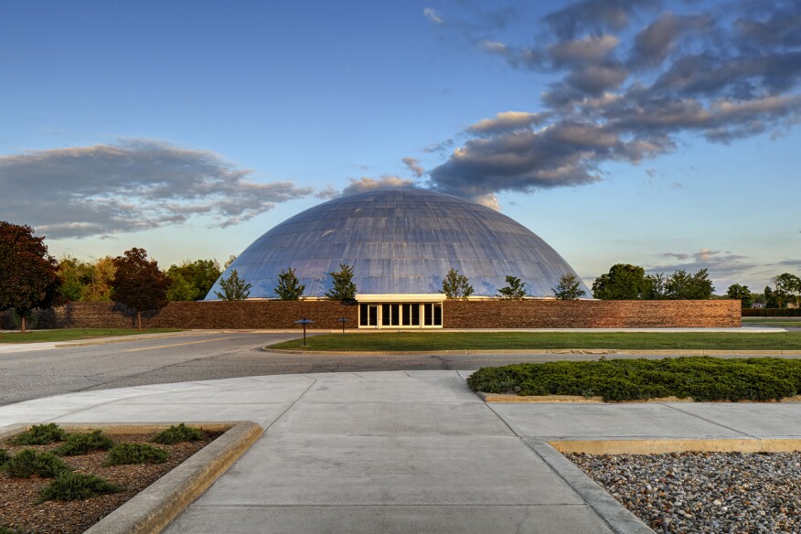
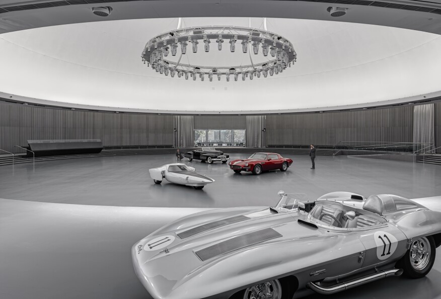
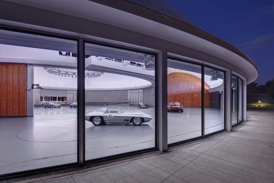
Nothing epitomized that sentiment quite like the Tech Center’s Design Dome, the shimmering, spiritual heart of the campus and, to a degree, the entire company. Clad with interlocking aluminum panels, the 185-foot-diameter, 65-foot-tall dome topped a 39,500-square-foot footprint that was embedded in the flatlands of the Detroit suburbs like a supersized silver marble. Since 1956, every GM product line has been presented to the leadership in the shadowless light of its interior display floor.
Sixty years later, the hemispherical form, modeled by Saarinen with a sliced tennis ball, remains perfect for its function. The technologies and systems inside the building, once hailed as the embodiment of the future, have not withstood the time with such grace. Many architects regard the Tech Center as Saarinen’s finest work-a synthesis of modernist elegance and American dynamism.
Philosophically, the pairing was more complicated. Saarinen often imagined his work in a historical context, with a respectful sense of cultural continuity that set him apart from other modernists. Yet he was working for General Motors, a pioneer of planned obsolescence. According to architectural journalist Jayne Merkel in Eero Saarinen (Phaidon, 2014), Earl’s decorative flourishes “offended Eero so much that he special-ordered his Oldsmobile without any chrome.”
Updating the Design Dome was like dissecting a Swiss watch, says SmithGroupJJR’s Urbanek. For example, the building’s mechanical systems, which required replacement, were tucked between the structure’s interior and exterior domes. Still, the most serious impediment to the dome’s continued service was the one responsible for its success: lighting. “Very seldom does lighting design criteria guide the shape of a building,” says Rodrigo Manriquez, SmithGroupJJR’s lighting design studio leader.
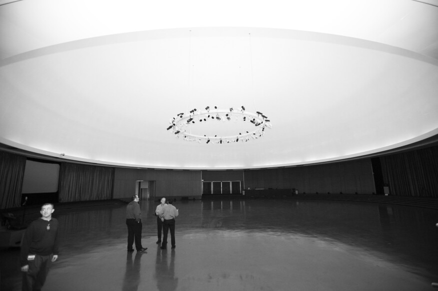
In 1993, GM’s designers, wanting the ability to spotlight products in showroom fashion, had a 30-foot-diameter lighting ring hung from the dome’s center. Its jumble of spotlights was controlled manually; if the designers needed to adjust the light, away went the prototype vehicle on the show floor, and out came the ladders and the lifts. This cumbersome process made regular product reviews an ordeal, to say nothing of the celebratory events held there from time to time.
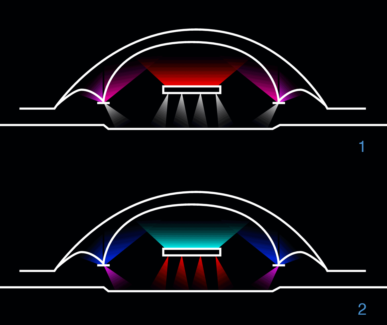
For this renovation, Manriquez decided to deploy technology more commonly found at concert venues than in corporate America. “It was a no brainer: We turned to LEDs and DMX controls,” he says. His team replaced the lighting ring with a 40-foot version that, together with fixtures in the dome ceiling, contains 112 luminaires that can be remotely controlled to spotlight the floor display or create an ambience for a party.
Dimmable RGBW (red, green, blue, and white) LED fixtures adorn the ring like miniature R2D2 robots, while other white-LED fixtures on the ring and in the ceiling illuminate display boards and secondary targets, like wheels or material samples. Every fourth fixture on the ring has the ability to project patterns.
To spike a hue complementary to the products on display, GM’s lighting technicians had used theatrical methods, such as affixing a blue acetate filter over a light source to highlight a blue car. But filtering reduces brightness, thus requiring more lights—and more energy—to achieve the same luminance. The new system relies on additive mixing, or varying the output of the different color LEDs, which lets GM fine-tune hues and achieve better color fidelity.

 |
 |
 |

Crédit Photos : Jim Haefner
Related Article : Design Technical Center General Motors 1956 ...
Denis Eveillard
Article précédent : The Riview, the mag by the Riviera Owners Association ... |
Article suivant : Buick Riviera sketch ... |
